A company logo sums up a product. But a surprising design element can change how consumers react – and it’s all to do with physics.
As any marketer knows, a brand’s logo needs to be instantly recognisable. But what if it could actually change consumer behaviour?
New Monash Business School research from the Department of Marketing suggests a deceptively simple visual design trick that conveys dynamic movement – making a static logo ‘energetic’ – could be the key to branding that compels consumers to purchase the company’s goods.
Before her academic career, Associate Professor Jasmina Ilicic worked in the advertising industry with internationally recognised brands including L’Oreal and Pfizer.
With a natural curiosity for the success of brand logos, her prior research has looked into the shapes and sounds of brand names. It was here that she stumbled on to the idea that some logos depict motion – even while static, they appear to be moving.
“We came across a paper which looked at static logos, where things that are static can still appear to be moving. But we wondered if we could look at dynamics – where a force is applied to something that’s moving in a logo,” Associate Professor Ilicic says.
Dynamic logo – movement with resistance
A good example of the dynamic movement affect is global hair care brand, Wella. The imagery of a stylised woman with flowing locks immediately evokes the hair care company’s product. But looking more closely, the double silhouette also gives the appearance that she is moving forward, while the graceful lines of her hair appear to flow backwards.
“There is an air resistance moving against her – her hair is not straight down,” Associate Professor Ilicic notes. “Marketers are using resistance in logos– but do they realise why they are using it?”
Associate Professor Ilicic along with co-author Associate Professor Stacey Baxter from The University of Newcastle, decided to investigate whether this approach was more effective than using an object that is simply moving.
![]()
They first turned to physics literature, considering forces such as gravitation, tension and air resistance. How could these be rendered as a logo?
“When a force is applied to something in motion, they are doing ‘work’. Because they are doing work they are expending more energy,” she explains.
“We then looked at how consumers judged the brand based on this logo – as logos are a way by which brands can convey meaning to consumers and depict what they stand for.”
It seems like a bit of a leap – do dynamic logos mean that consumers perceive that the brand is working really hard? Do they put in more effort?
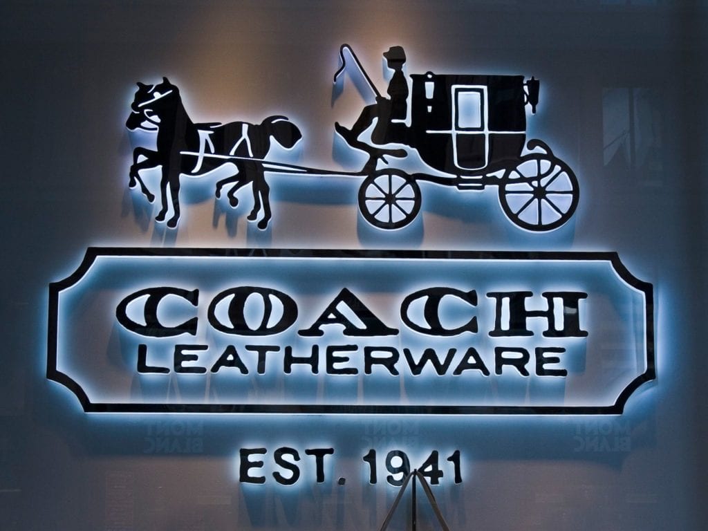
To test this, she decided to study the logo of US leather goods brand, Coach. It was a good example of this push-pull dynamic movement in that the logo of horses pulling a carriage makes the animals appear to be pulling forward on the reins in an effort to move the coach.
Associate Professor Ilicic explains that the horses are trying hard to keep moving forward because the tension caused by the reins being held is pulling them back – creating resistance.
“Is Coach perceived to be a brand that works hard and then does that lead people to believe the brand is an energetic brand? Is it a powerful brand? Does it have momentum and drive? We found that it does,” Associate Professor Ilicic says.
“If you look at the Coach brand that’s exactly the meaning of the brand. It’s a traditional brand but it is dynamic in the way it presents itself. It keeps changing and updating.”
Coach is an interesting choice. Although founded in 1941, it has remained fashionable, up-to-date and a leader in the luxury lifestyle category. It is owned by Tapestry, Inc, a NYSE-listed luxury fashion company that includes Kate Spade New York and shoe designer Stuart Weitzman in its brand portfolio.
In a relatively short time Coach handbags have infiltrated the Australian market, even as one of its main Australian competitors, Oroton, struggles to stay afloat. Oroton went into voluntary administration in November 2017 but was saved by Caledonia Funds Management chief investment officer Will Vicars, who owned 18 per cent of the 79-year-old company’s ASX-listed shares, and acquired the brand from administrators Deloitte late last year.
While the embattled brand continues to operate, it is not seen to be dynamic. Associate Professor Ilicic points out that at the moment the logo is static, featuring just its name, without a symbol. However, Mr Vicars has announced plans to revive the Oroton brand.
I like birds – logos with resistance
To understand consumer perception of dynamic brand logos, Associate Professor Ilicic conducted an unusual study looking at the use of birds, which involved both air propulsion and air resistance. (Brands such as Twitter and Dove use birds and it is quite a popular choice.)
The study used logos that had a wind gust where it either blew towards the bird or with the bird, propelling it along.
“We concluded that this idea of resistance enhancing the brand logo only works if the force is against you – if it’s a drag force. If the force is helping the object move, then the brand is not perceived to be working hard,” Associate Professor Ilicic says.
An example of this would be if you had a tension force that was pulling something forward. In the Coach logo, it would be someone holding onto the horses and pulling them along; helping them, rather than holding them back. Associate Professor Ilicic explains that wouldn’t work.
Consumer trial
While the concept behind the dynamic logos seemed logical, they had no data showing that it would influence actual consumer behaviour. So Associate Professor Ilicic and her co-author conducted a lab experiment using hair combs.
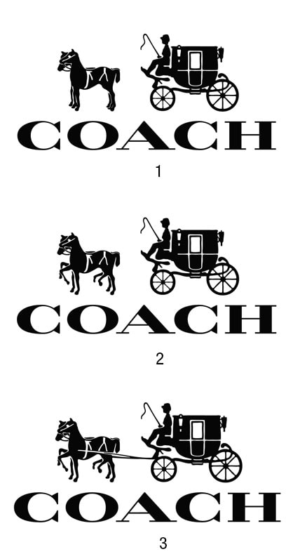
Not wanting to reveal the study was in fact about brand logos, they asked the group questions about their hair care routines. They placed 10 hair combs on a table – with one of three logos that was a variation of the Coach logo.
In one condition the logos were manipulated so that the horses were standing still and there was no rope (1). The other condition featured the horses moving but there was no rope attached – so there was no force (2). The third logo was a version of the real Coach logo with the horses moving and the tension force applied – rope attached (3).
Once they finished asking the participants about their haircare routines they could leave and on their way out they could choose to take a comb.
And the outcome? Some 74 per cent of people took combs when they were paired with the dynamic brand logo (3), compared to 46 per cent when they saw the static logo (1), or 56 per cent when they saw the logo with motion but without force (2).
Following the results, marketers may be looking at their logos in a whole new way – making sure they have some tension force that is against an object in motion, to ensure it is perceived as energetic and hardworking enough to influence consumer attitudes and behaviour.
“While it’s a small tweak to the logo, it has a significant impact on consumers’ actual behaviours,” Associate Professor Ilicic says.